I’m writing my first Cordova / Ionic Android and iOS app, and ran into an issue when submitting to the iOS app store. In order to submit your app, you need screenshots. And not the “minimum of 320px on the longest side” type of screenshot where you can submit almost anything, but the “must be exactly X and Y dimensions” type where you need (up to) 5 screenshots per device type.
This was a problem for me, because while I have a Mac, it’s slow as a wet week. It’s a 2009 unibody Mac that I bought off eBay. I went for the cheapest Mac I could find because I just needed it to deploy to my test device (an iPhone 4 I also bought off eBay) and fire off production builds when I was ready.
Because it’s so slow, running the simulator on it is nigh on impossible. It takes forever to start up and click on stuff, so I ruled that out. I then came across snapshot, part of the fastlane set of tools. This would let me create a new UI test, then edit the code to take snapshots when I needed to. It still relied on the simulator in the end, but it was automatic, so I could let it run overnight.
But I had to rule that out as well, because Cordova apps aren’t fully supported. I’d click on some elements in my app while recording a UI test, and they’d just get logged as generic ‘element.tap()’ events that did nothing when played back. Plus it required changes to the xcode project that would have just been overwritten when I next built the app, unless I wrote a hook to make this stuff for me. With no (easy) way around all that, I turned to “faking” the screenshots using a browser.
Google Chrome (and in fact, almost every other browser out there) has a set of developer tools that can emulate various screen sizes. The iPhone 4 emulation is nearly pixel perfect compared to an actual iPhone 4, so I decided to go for that. I fired up Ionic’s “ionic serve” command (or Cordova’s equivalent) and went to town.

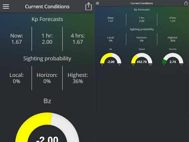
iPhone 4 on the left, custom size on the right. Whoops!
The problem is, the size required for the 3.5″ screens is 640×920 and Chrome’s iPhone 4 preset gave me screenshots that were half that size. So I added a manual preset that was 640×920. But then my previews were off, because media queries kicked in and it was showing my app differently to how it really was.
Zooming did nothing in Chrome, and overriding the media queries was going to be a not-worth-the-hassle type of difficult. So I turned to Firefox.
Firefox gave me some success, because I could set a custom size, then zoom the window in 200% so in theory, I’d have a window size of 640×920, but the content doubled in size to negate the media queries. But when I clicked the screenshot button, I got a screenshot that didn’t honor the zoom settings in the way I expected, so I was left with a screenshot that was 320×460.
After literally hitting my head against the desk and trying six different screenshot tools, and thinking I’d have to resort to using Windows’ screenshot button and stitching the results in Photoshop, I finally nailed it.
 There’s a second screenshot button in Firefox’s dev tools. You have to turn it on under the settings menu, but it gives you a screenshot of the viewport as it actually appears. I finally had a way to get screeshots at the correct resolution AND the correct view!
Now I was left with one last minor issue: How do I quickly sort out the screenshots?
So I did what I do best – Write a script to automate that shit!
Just run that in node.js (in the same folder as your downloads) and start taking screenshots. Anything it finds, it’ll compare the image dimensions and shove everything into the right folders.
A few minutes later, I had all the screenshots I needed and I was able to submit my app for approval by the end of the night. Ahh progress!